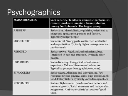
Audience profiling
|
|
The target audience for my magazine that would most likely have a strong interest in my magazines house style would be females ranged between 18 to 28 years old. However, according to my research into theories such as the Blumler and Katz theory, uses and gratifications theory, reception theory and Maslow's hierarchy of needs theory, the Blumler and Katz theory stood out as it stated how teenagers commonly buy magazines that attract their attention when it comes to their personal desires. Personally, I don't feel that this only apply to teenagers. This is because it may change as LOYALTY has a strong connection with popular social media sites such as Instagram, an influencing application which easily grabs the attention of their users which is why the age range may lower to as low as teenagers at the age of 13 and reach as old as full grown adults at the age of 35. When it comes to genders, I believe that this magazine would most likely have more females interested than males as generally speaking, most of the overall genre which just like the magazines I found out through my researched magazines, Vogue and Ellen, which I specifically chose since we both aim for a similar target audience. The reason behind this is because the products which are displayed in the magazine tend to appeal more towards women than men such as my article page which was all about makeup and beauty tips.
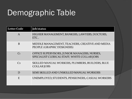
As a result of my choices, the demographic representation would be A which stands for upper middle class, B, middle class and C1 which is lower middle class. The reason behind this is because people would love this type of information from this range of social classes. What I also took into consideration when creating my magazine was how many people from different ethnic backgrounds would actually like to purchase my magazine. This is why I purposely used models from different ethnic backgrounds as this would not only increase the number of sales, but there would be good response from different races as they see we accept all ethnicities to be displayed on my magazine.
As a result of my choices, the demographic representation would be A which stands for upper middle class, B, middle class and C1 which is lower middle class. The reason behind this is because people would love this type of information from this range of social classes. What I also took into consideration when creating my magazine was how many people from different ethnic backgrounds would actually like to purchase my magazine. This is why I purposely used models from different ethnic backgrounds as this would not only increase the number of sales, but there would be good response from different races as they see we accept all ethnicities to be displayed on my magazine.
writing and design styles of similar product
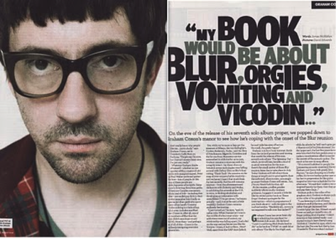
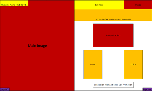
Main Image:
Colour Scheme:
Headlines / title:
- Photo takes up half to the double-spread article sheet leaving room on the other side for the article itself.
- The celebrity who is better known as Graham Coxton is part of an English rock band named ''Blur.''
- A convention we see which is used in most magazine would be the establishment of a direct mode of address from the artist to the audience however, he has no visible expressions which match the color theme which seems to be slightly muted.
Colour Scheme:
- Minimalistic colour scheme which involves colours such as Black, White and grey colour scheme
- Colours contrast to the article as the nature of the quote is far more interesting.
- Darker colours connote feeling down which helps to show there will be truth spilled within the article making the target audience more likely read the article as they want to know whats wrong.
Headlines / title:
- Heavy font put into a bold texture in order to grab attention
- Integral headlines since they include topics and themes which catches the attention of the readers
- Fans would be more likely interested in almost every word since overall, it contributes to the general British pop era grabbing a lot more attention from the readers of the magazine
plan and develop ideas
Colour schemes and their uses in advertising
Every colour creates different responses to the human mind. They can be divided into two categories; warm and cold. Warm is associated with energy while cold colours are usually associated with calmness and security.
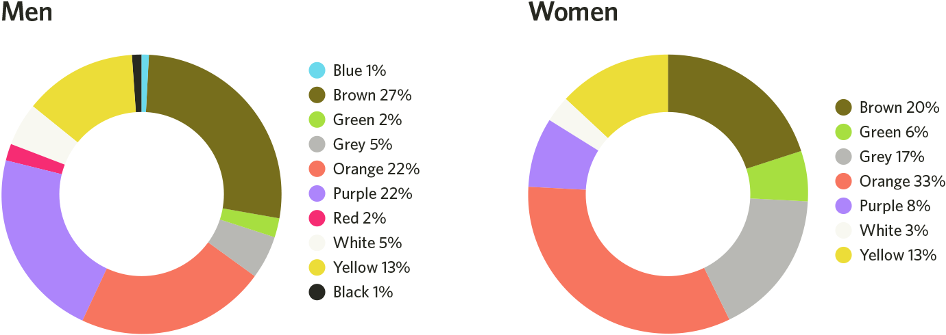
I therefore for my magazine decided to incorporate the least hated colors from both genders; red, white and Black but ill keep my mindset open to green and blue.
|
Red
What does red associate itself with? Red usually stands out and helps to grab attention as it's used to convey excitement or extreme emotions. Colour code?
|
Green
What does green associate itself with? Green can be associated with wealth and finance whilst also entertainment and leisure. Colour code?
|
|
White
What does white associate itself with? White can be pure, innocent and classy or protective as its the colour of perfection. Colour code?
|
Blue
What does blue associate itself with? It helps to connect whilst creating quality relationships as motivation to drive further. Colour code?
|
Initial idea mock-up:
Here is a drawing which is used to illustrate the layout I used for my final Article Page:
My Script
| loyalty_magazine_article_script_by_vanxmedia.docx |
Photography
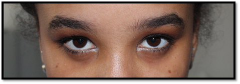
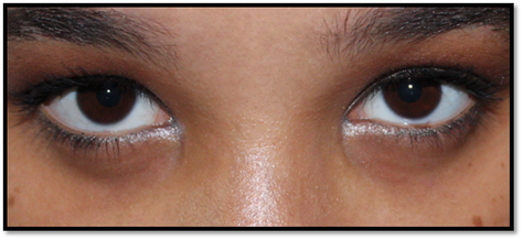
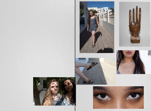
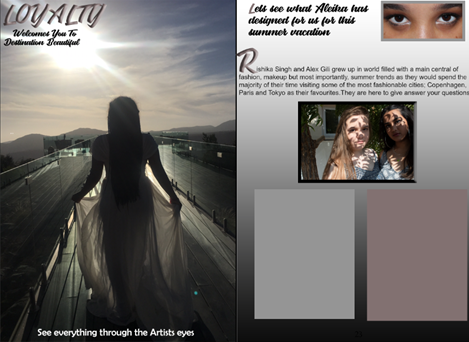
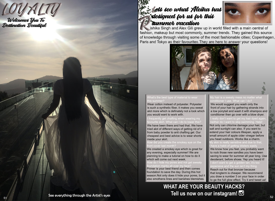
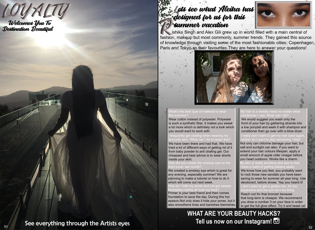
I took a lot of different image however, my chosen photo is not in this gallery. I decided to use my original article taken photos for my content page as it feels more lively.


Instead, I redid the photos and these were my favorite 3 pictures. I used the first picture for my final article page. I liked the way the shadows of the leaves were on their skin more than the others.


step-by-step production:
I have written a step by step production from the beginning of editing my magazine article to the end so I could take note of any changes I've incorporated.
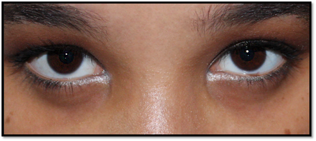
Edit one: eyes
|
I began with spot healing to get rid of access eyebrow hairs and any blemishes and I also cropped the picture, so it focuses more on the target, my eye makeup. I also used patch tool to get rid of any imperfections
|
|
2. I then decided to use sharpen tool to emphasize my eye color and make it gain this type of shine which automatically would make it stands out.
|
|
3. I then used the brush tool to make the colors stand of the makeup stand out and changed the opacity to 10% so it doesn’t look fake.
|
Final Result:
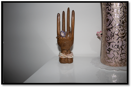
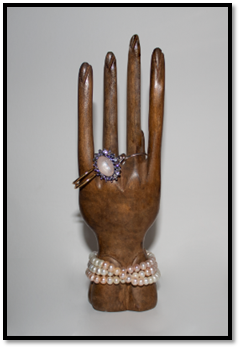
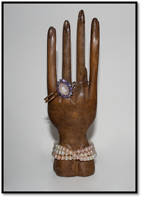
Edit 2: Hand
|
1. I began the process of editing this picture by getting rid of the distraction on the right side of the picture by cropping the picture to a smaller scale.
|
|
2. I then moved on and began using the spot healing tool to make the wood grains look better in some areas and increase any wood gradients while getting rid of shine in areas where they aren’t needed.
|
|
3. I then used the brush tool to make the colors stand of the wood stand out and changed the opacity to 10% so it doesn’t look fake. I purposely used a black to shade since the wood grains looked better darker than light.
|
Final Result:
Article
|
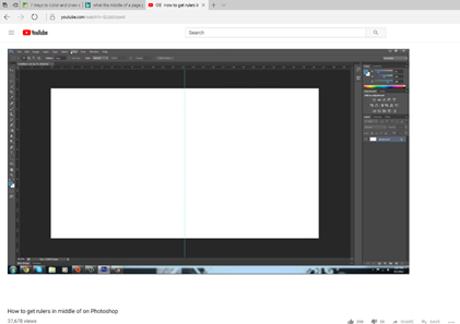
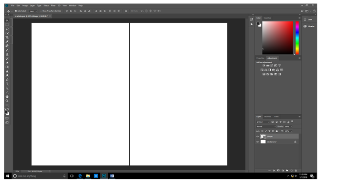
1. To make the actual article page, I began the process by drawing a straight line directly on the middle of the page as a guideline to my article format. At first, I wasn’t sure how to do it so I did some research and found this tutorial on YouTube which assisted me: https://www.youtube.com/watch?v=l2Ltz05rpw0
|
|
2. I followed his steps and this was my outcome:
|
|
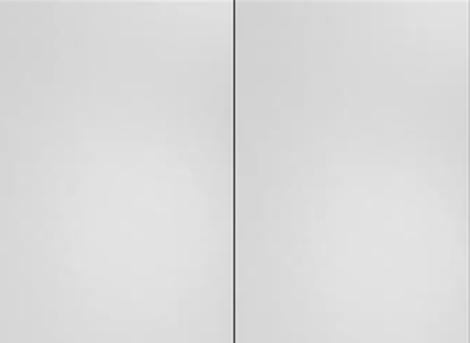
3. To make my magazine stand out and not look boring or unattractive to the user, I decided to place a grey background to give it a little bit of a pop.
|
|
4. I then placed the images which we edited plus some other un-edited images onto the page which I would later either remove or change position.
|
|
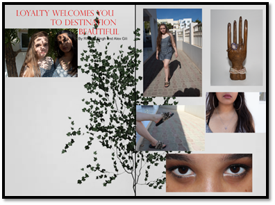
5. Proceeding on, I went to find a picture of a tree which I previously used on my content page in order to keep a theme which has continuity. I decided to get rid of its background color so it would blend in with the grey background.
|
6. I then placed it on the magazine and started to write my article. In order to write my article, I needed to do a lot of research. Before writing this, I needed to play around with the images and get it a bit more organized with the text layout, filters and all the access background distractions in some of the images.
|
|
|
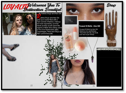
7. Before moving on to writing the actual article, I decided to get feedback on my article page. I realized that my page didn’t fit the front page of the magazine since it was just too busy. I did more primary research on vogue magazines and I then did secondary research on different websites what I could write for my article.
|
|
8. I continued writing my article and one I was done I added a tree which was also on my content page so I have a continuous theme going on. I then changed my boxes it include bevel and embossed it to stand out.
|
|
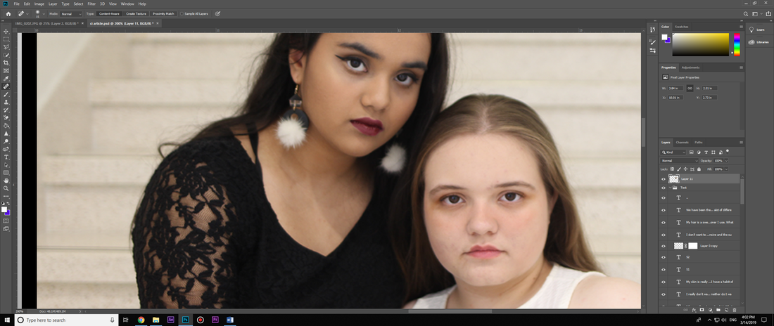
9. I added dots as I found the background a bit plain but then I realised how I did'nt really like the picture of the artist as the lighting of the leaves made them look hidden. I wanted them to be more outwards with their audience members so the last thing I did was change the picture:
|
|
10. I wasnt too happy with the picture I chose to represent the artists so as a result, I changed the picture and just like my front page, I decided to also duplicated the layer and used the spot healing brush and patch tool to edit some small blemishes
|
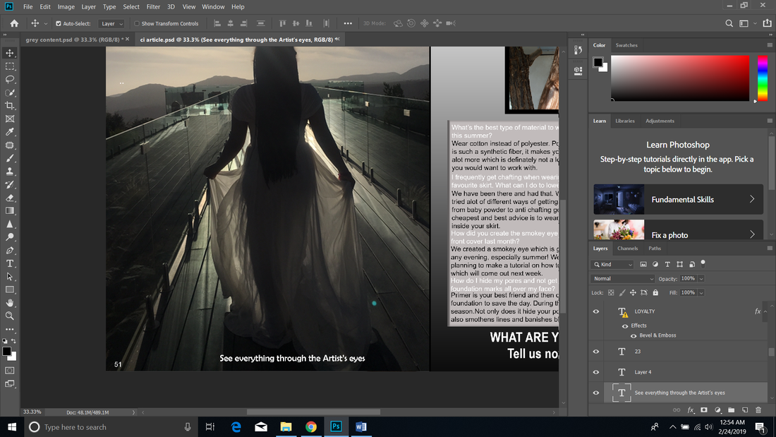
|
11. I then worked on the text. On the left article page made the font smaller so it sat in a better place in order to make my magazine as aesthetically pleasing as possible.
|

