Notes taken from the group discussion:
FRONT MAGAZINE DECONSTRUCTION:
clash Magazine
|
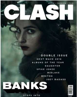
MASTHEAD: The font of this magazine is large, bold and in capital letters to give emphasis to the magazine's title ''CLASH'', an onomatopoeia word making the magazine sound powerful. It takes up 1/4th of the magazine cover. It is placed at the top of the magazine so that it's seen quicker in shop stands for clients to pick off the shelves.
MODE OF ADDRESS: The singer Banks is the model in the picture which is important since she is a famous singer which means more people would be keen on buying the magazine for that cause alone. She has a direct gaze towards the public which creates an explicit connection between the target audience while portraying her confidence. |
TARGET AUDIENCE: The magazine's main focus would be at those who enjoy Banks music. As for age, it looks like it's potential clients are more of a mature audience meaning people aged 16 and above. Furthermore, the featured colours used are black and while which could suggest that the magazine is aimed at both genders as they are both known to be neutral colours. Her audience is mainly psycho-graphic.
ANCHORAGE TEXT: The anchor ''BANKS, step into the light.'' This helps people interpret the photo in a way which links to the text. The image creates the idea that BANKS is becoming a well-known artist, a public figure and her sound is being heard by many coming from previously she was underground due to the images dark colour scheme.
MISE-EN-SCENE: The artist on the front cover of this issue of CLASH is BANK, an alternative R&B singer. The image of her is dark which reflects the sound of her music and the lyrics she creates. The dark image also reflects the month the issue was released (January). The photograph itself is intriguing which catches the eyes of many before they read the text. All of these features are being used to attract a specific audience into buying their music magazine.
FEATURED COLOURS:
COVER LINES: 'CLASH' magazine doesn't include any type of captions of what the article entails inside besides a basic list of the content of the magazine such as Albums of the year. As a result this could act as their unique selling point as it causes the consumers to question what is within which in conclusion, results to the purchasing of the magazine.
BAR CODE/ISSUE NUMBER: The bar code has been and is usually placed strategically to ensure the principal features are not distorted which is smart as we can see the price and prevent any of the image being blocked off especially the principal features.
ANCHORAGE TEXT: The anchor ''BANKS, step into the light.'' This helps people interpret the photo in a way which links to the text. The image creates the idea that BANKS is becoming a well-known artist, a public figure and her sound is being heard by many coming from previously she was underground due to the images dark colour scheme.
MISE-EN-SCENE: The artist on the front cover of this issue of CLASH is BANK, an alternative R&B singer. The image of her is dark which reflects the sound of her music and the lyrics she creates. The dark image also reflects the month the issue was released (January). The photograph itself is intriguing which catches the eyes of many before they read the text. All of these features are being used to attract a specific audience into buying their music magazine.
FEATURED COLOURS:
- Black
- White
COVER LINES: 'CLASH' magazine doesn't include any type of captions of what the article entails inside besides a basic list of the content of the magazine such as Albums of the year. As a result this could act as their unique selling point as it causes the consumers to question what is within which in conclusion, results to the purchasing of the magazine.
BAR CODE/ISSUE NUMBER: The bar code has been and is usually placed strategically to ensure the principal features are not distorted which is smart as we can see the price and prevent any of the image being blocked off especially the principal features.
Billboard Magazine
|
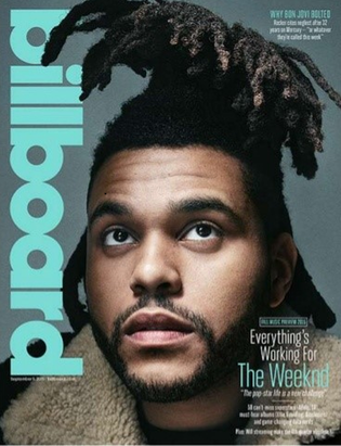
MASTHEAD: The masthead is placed on the left - hand side of the magazine vertically. To enable the image to be the focal point. This could potentially suggest that even without the masthead, this magazine is still well-known.
MODE OF ADDRESS: The singer The Weeknd is the model for this magazine and he seems to be looking away from the camera while gazing upwards and outside of the frame which creates intrigue into knowing what he's looking at. As a result, it's quite effective which would cause the target audience to look at the content within as we aren't able to gain eye contact with the main central image which has captured our attention. |
|
FEATURED COLOURS:
COVER LINES:
As we look around the image, we notice that there isn't much action regarding to the text surrounding the image which as a result, helps us keep more of our focus on the photography. There is reference to music artists and streaming. The pull quotes are written using a larger size to separate it from the main cover lines. Boxed text are also used to separate he other text which as a result, makes the magazine look less crowded.
ANCHORAGE TEXT:
The anchor for this magazine says ''everything's working for the weeknd'' This phrase helps to pin the image together with the text while assisting in the understanding of the meaning of the photograph taken of The Weeknd. It helps to suggest that The Weeknd has recently gained a lot of success and popularity which could mean that the angle of gaze symbolizes the idea that everything is looking like a smooth road for him in the future.
PULL QUOTE:
The pull quote is used to entice the potential buyer to want to know more about The Weeknd, how is going to overcome his challenges and what experiences he has already had in his found stardom.
DATE AND ISSUE NUMBER:
This tells us the year and the month this Billboard magazine was published as well as the issue number which is extra information for the customers when purchasing this magazine.
- Blue
- White
COVER LINES:
As we look around the image, we notice that there isn't much action regarding to the text surrounding the image which as a result, helps us keep more of our focus on the photography. There is reference to music artists and streaming. The pull quotes are written using a larger size to separate it from the main cover lines. Boxed text are also used to separate he other text which as a result, makes the magazine look less crowded.
ANCHORAGE TEXT:
The anchor for this magazine says ''everything's working for the weeknd'' This phrase helps to pin the image together with the text while assisting in the understanding of the meaning of the photograph taken of The Weeknd. It helps to suggest that The Weeknd has recently gained a lot of success and popularity which could mean that the angle of gaze symbolizes the idea that everything is looking like a smooth road for him in the future.
PULL QUOTE:
The pull quote is used to entice the potential buyer to want to know more about The Weeknd, how is going to overcome his challenges and what experiences he has already had in his found stardom.
DATE AND ISSUE NUMBER:
This tells us the year and the month this Billboard magazine was published as well as the issue number which is extra information for the customers when purchasing this magazine.
CONTENT PAGE DECONSTRUCTION: Q MAGAZINE
|
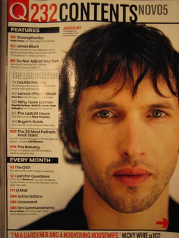
MASTHEAD: For the content page, it is clearly titled '232 Contents' in a bold red text in a size larger than all the other text to catch more attention towards the amount of articles which Q magazine has published. They also added their magazine title in order to have a flow of continuity in the magazine.
MODE OF ADDRESS: We see the well known celebrity James Blunt being the model for this magazine and he has established a direct mode of address with his audience. As a result, it's quite effective which as a result has created a bond with us since he's directly looking at us in a way like he wants to tell us something important, pulling us towards the angle of purchasing the magazine. |
FEATURED COLOURS:
FEATURES:
As we look around the image, we notice that there is quite a lot of action regarding to the text surrounding the image which as a result, helps us keep more of our focus on the text. There is a list filled with features and every-month reoccurring features which helps the audience know what they are going to purchase and their main interests in the magazine. It's also written in bold to attract us to reading it and it gives us a brief overview of what the features are going to cover in the magazine. This is also assisted by the page numbers, they put the page numbers quite close together so it's like rows and rows of features following each other instead of them having to go pages and pages just to find the featured article.
DATE AND ISSUE NUMBER:
This tells us the year and month this Q magazine was published as well as the issue number which is extra information for the customers when purchasing the magazine so they do not by a magazine which is out of date or risk purchasing the same magazine again.
- Red
- White
- Black
FEATURES:
As we look around the image, we notice that there is quite a lot of action regarding to the text surrounding the image which as a result, helps us keep more of our focus on the text. There is a list filled with features and every-month reoccurring features which helps the audience know what they are going to purchase and their main interests in the magazine. It's also written in bold to attract us to reading it and it gives us a brief overview of what the features are going to cover in the magazine. This is also assisted by the page numbers, they put the page numbers quite close together so it's like rows and rows of features following each other instead of them having to go pages and pages just to find the featured article.
DATE AND ISSUE NUMBER:
This tells us the year and month this Q magazine was published as well as the issue number which is extra information for the customers when purchasing the magazine so they do not by a magazine which is out of date or risk purchasing the same magazine again.
Article page deconstruction: NME MAGAZINE
Main Image:
Colour Scheme:
Headlines / title:
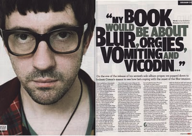
- Photo takes up half to the double-spread article sheet leaving room on the other side for the article itself.
- The celebrity who is better known as Graham Coxton is part of an English rock band named ''Blur.''
- A convention we see which is used in most magazine would be the establishment of a direct mode of address from the artist to the audience however, he has no visible expressions which match the color theme which seems to be slightly muted.
Colour Scheme:
- Minimalistic colour scheme which involves colours such as Black, White and grey colour scheme
- Colours contrast to the article as the nature of the quote is far more interesting.
- Darker colours connote feeling down which helps to show there will be truth spilled within the article making the target audience more likely read the article as they want to know whats wrong.
Headlines / title:
- Heavy font put into a bold texture in order to grab attention
- Integral headlines since they include topics and themes which catches the attention of the readers
- Fans would be more likely interested in almost every word since overall, it contributes to the general British pop era grabbing a lot more attention from the readers of the magazine
