un-annotated Article (first version of text)
fINAL ARTICLE PAGE
redrafted script after editing (final version)
FINAL ARTICLE PAGE + analysis
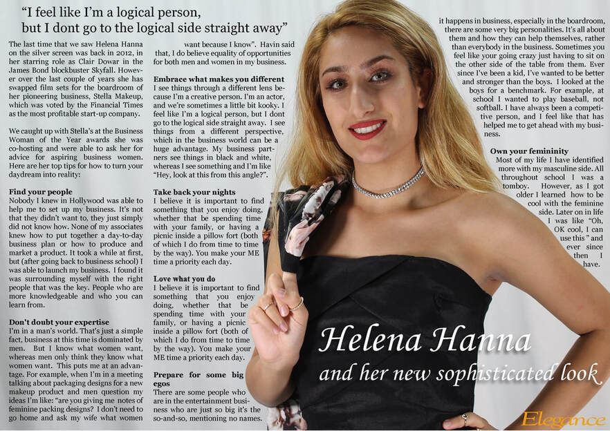
Main image:
- The photo takes up almost half of the double-spread article sheet leaving room on the left side for the article itself.
- The photo of the artist Helena Hanna really stands out especially due to the choices of her blonde hair and bright red lipstick.
- A convention we see which is used in most magazine would be the establishment of a direct mode of address from the artist to the audience. She is very bright and smiles confidently.
Colour scheme:
- The article page itself contains minimalistic colour scheme containing the traditional black, white and gray colour scheme.
- This is very effective as it makes the model stand out due to the bright colours, highlighting how the article page is all about Helena Hanna and her new sophisticated look.
Pull Quote:
- On the top of the article page, there is a pull quote from things said in her interview.
- This is very effective as it highlights one of the best pieces of advice and how she feels overall.
Title:
- The fact that the title of the article is on her black dress makes it stand out as its a brighter shade, making me as a consumer automatically focus on the text there due to the visual impact it has on.
- The font itself is very simple but matches the overall house style of the magazine article.
- Fans would be more likely interested in almost every word since overall, it contributes to the general Fashion statement of the model grabbing a lot more attention from the readers of the magazine.
